
Our recent post comparing six recent logo changes from big brands took off on LinkedIn. In the comments, some people loved the new logos. Some didn’t. But one question kept coming up, and it’s a good one: what changed beyond the logo?
The logo gets all the attention, but it's rarely all that changes when a company rebrands or refreshes its visual identity. So we dug into each of these logo changes: the typography, color, strategy, and rollout behind them. Here's what we found.
McLaren: one brand for the cars and the racing team
The logo story: The new wordmark is drawn from the sign that hung above the service station Bruce McLaren’s parents owned in Remuera, Auckland—the place where Bruce built the car that won him his first race.
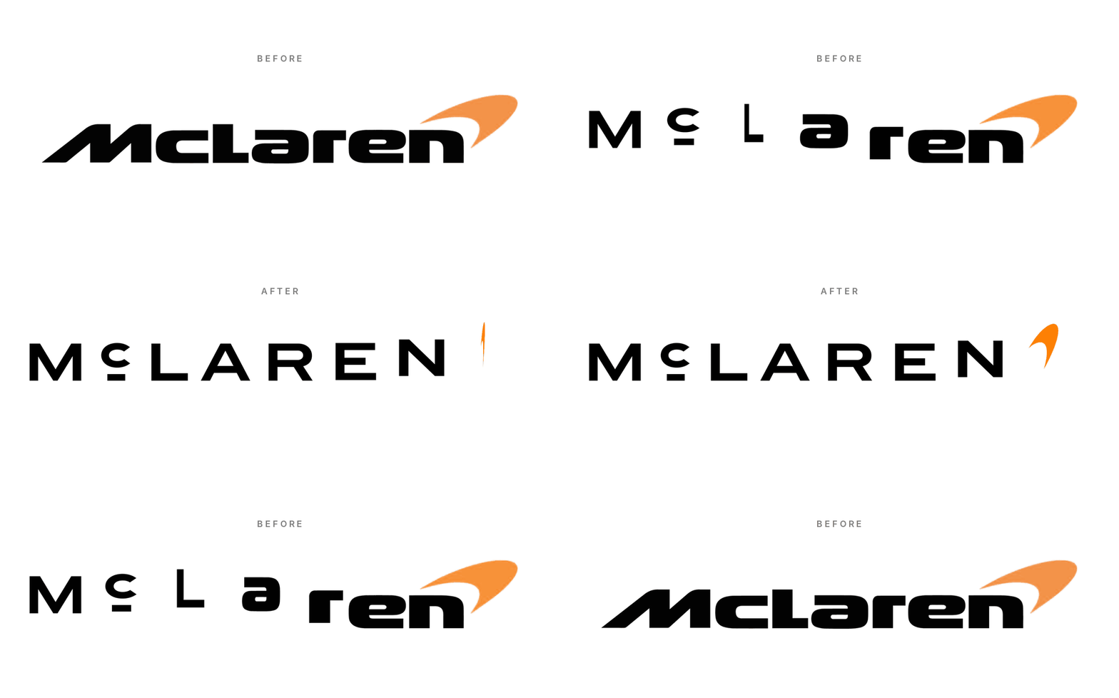
Beyond the logo:
One system, two businesses. For the first time, McLaren Automotive and McLaren Racing share a single identity. That's the strategic impetus for this work—the rebrand is an architecture decision as much as a design one.
A bespoke typeface, McLaren Sans, launched alongside the wordmark.
What stayed: the Speedmark, papaya orange, and the Speedy Kiwi. Continuity was clearly a priority given the brand’s loyal fanbase.
Tropical Smoothie Cafe: “tropical” as a feeling, not a place
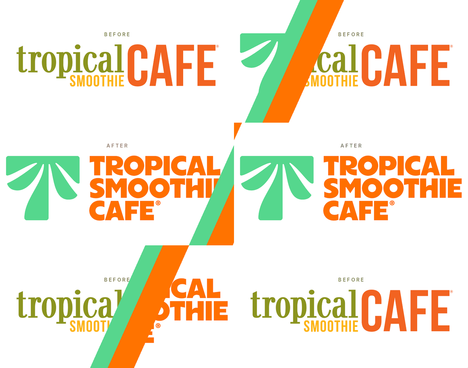
The logo story: The new "Palm T" fuses a palm canopy with the letter T into one chunky symbol, designed with Jones Knowles Ritchie.
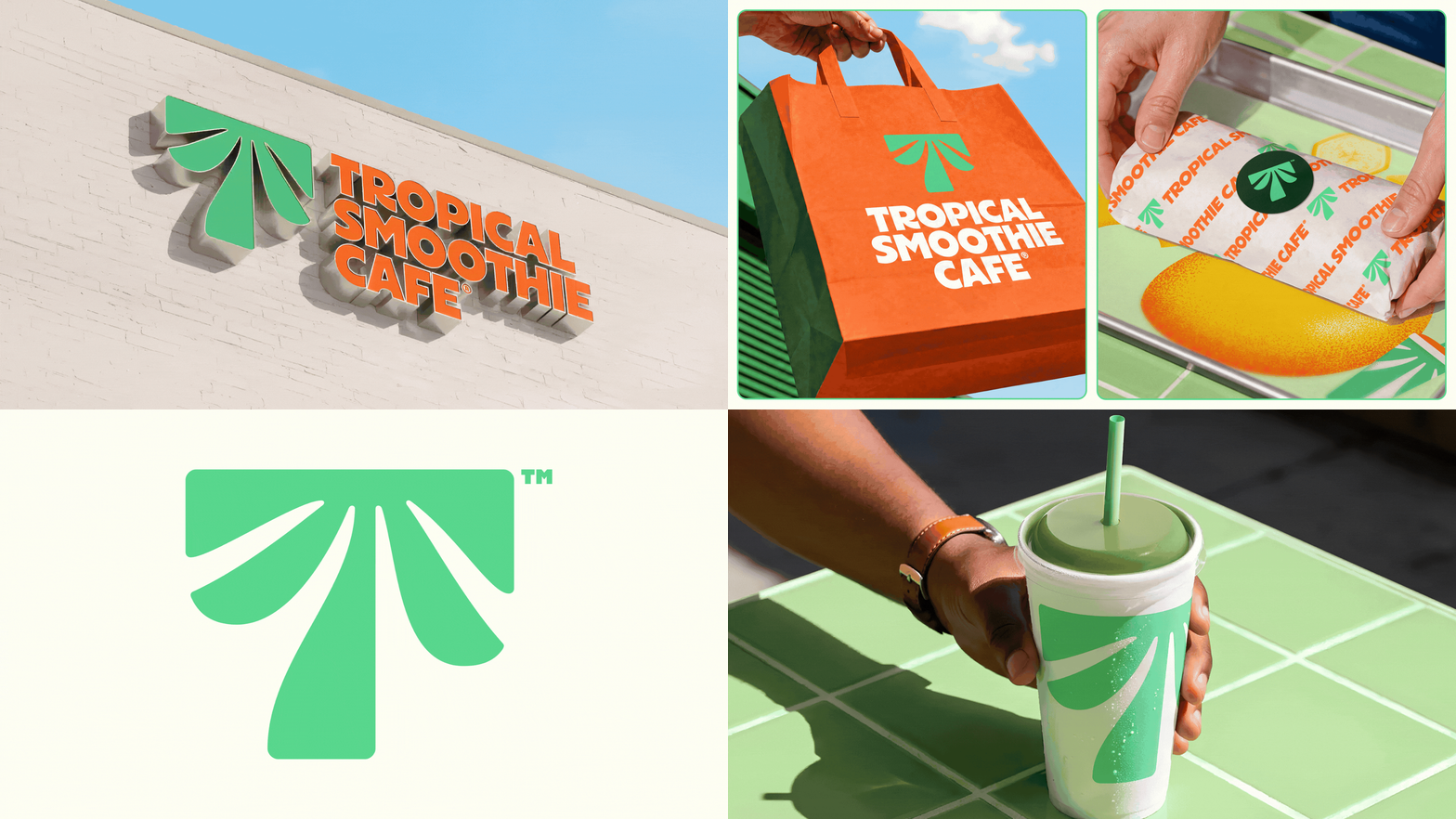
Beyond the logo:
A new palette built on Palm Frond Green and Sunset Orange.
New illustration, photography, and motion—warm, sunlit, and appetizing rather than coconut-and-beach clichés.
Packaging built around the symbol. The Palm T stretches across cups, shrinks onto wrappers, and stands alone on bags.
A new website and app rolling out as part of the refresh.
An idea at the center. The brand's "Eat Some Good!" philosophy now anchors the identity and guest experience.
Carter's: a promise first, a logo second
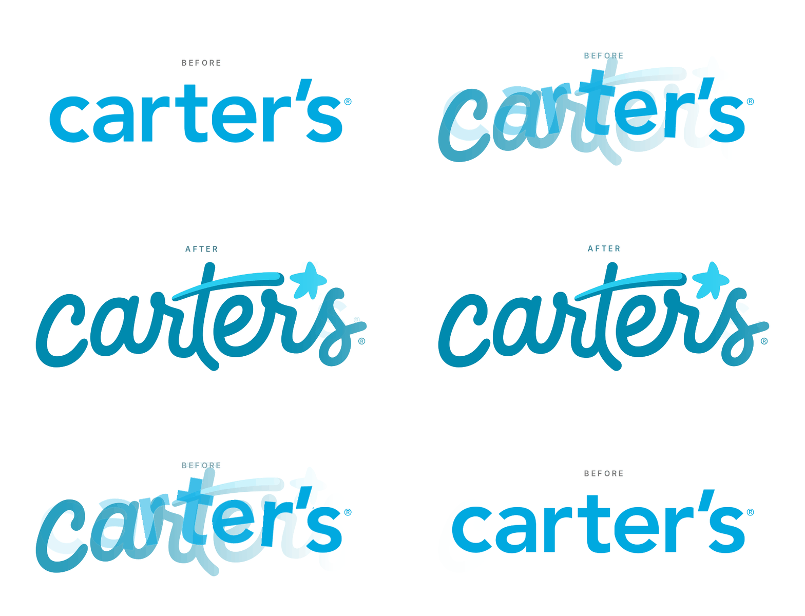
The logo story: Carter's first new logo since 2000. The script takes cues from the company's original 19th-century mark, and the apostrophe has been swapped for a shooting star. In September, the brand shared the story and evolution behind the logo changes over the years on Instagram.
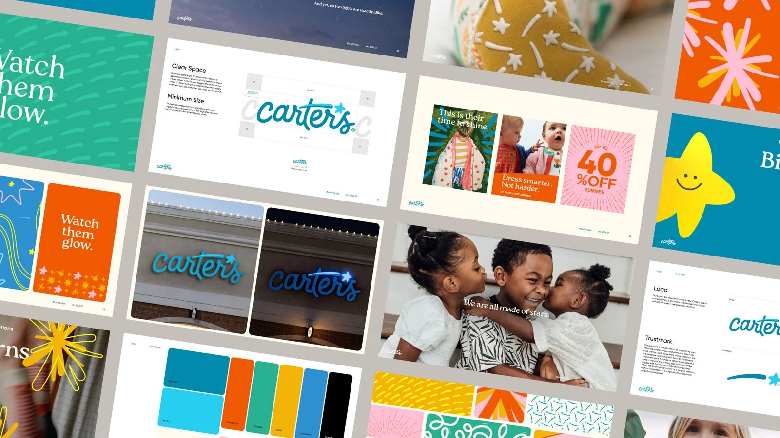
Beyond the logo:
A new brand promise, "Let every child's light shine." The company calls it its North Star, and the star in the logo is the visual expression of it.
A campaign platform, "Watch Them Glow.” Running across connected TV (Roku, Disney+, Hulu, and others) through December 2026.
Retail. A new sleepwear-focused in-store concept, the Stellar Sleep Shop.
Social and community. A dedicated creator program, a partnership with Outward Bound, and community initiatives called Light Makers and the Glow Grant.
Built on research. Nearly a year of consumer research with Gen Z and millennial parents shaped the strategy.
A two-year rollout. Channels in 2026, with retail, product, and packaging updates following in 2027.
Intuit: from a portfolio of products to "One Intuit"
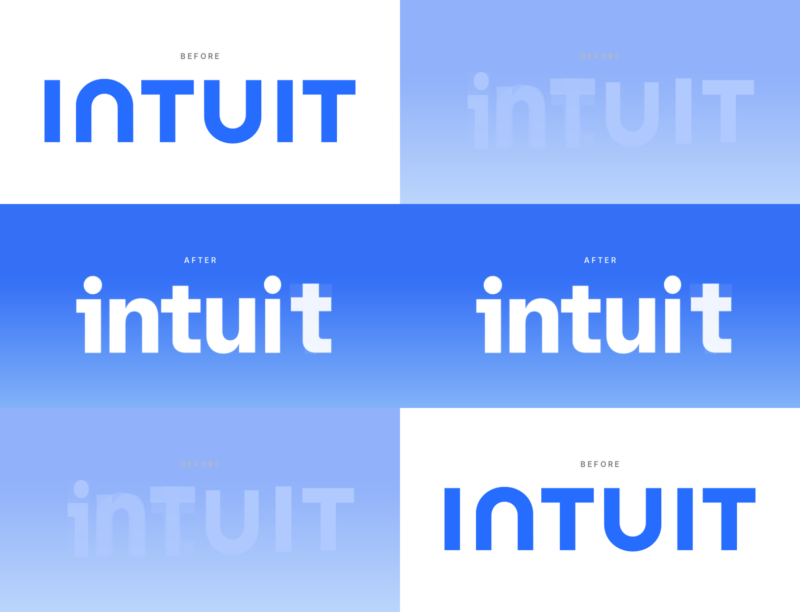
The logo story: A redesigned, all-caps wordmark, plus a new standalone Intuit I that works as a symbol and graphic device in its own right. Designed with Jones Knowles Ritchie.

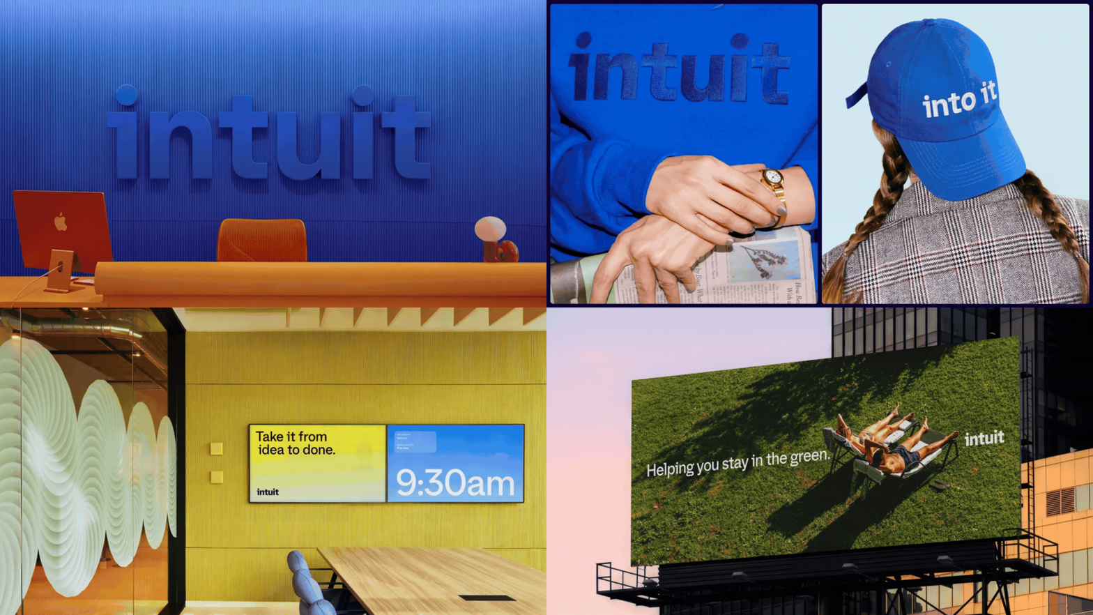
Beyond the logo: This might be the most complete system of the six.
Brand architecture. TurboTax, QuickBooks, Credit Karma, and Mailchimp now sit under a shared visual and verbal system. Crucially, the sub-brands weren't reinvented—the new system just makes the connection to the parent visible.
A custom typeface, Tally.
An evolved colour palette, new photography, illustration, iconography and motion.
A new tone of voice and a redesigned Intuit.com.
AI gets its own identity. Intuit Intelligence is a new name and identity bringing Intuit’s AI and human expertise together. When the product is your money, users need to know what is helping them—and that’s now a brand problem, not just a product one.
Instagram: the wordmark got the headlines, the type system is the story
The logo story: Instagram’s first wordmark change since 2016—custom lettering (not a font you can download) that blends script and print. Yes, the “Instagzam” jokes were everywhere. Designed by an in-house team in partnership with Koto.
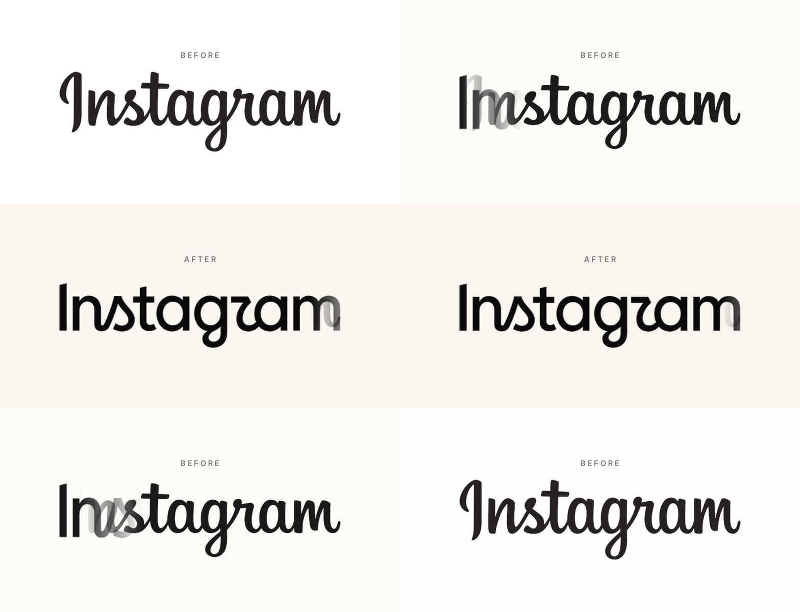
Beyond the logo:
A full type family. An updated Instagram Sans, plus two new faces—Instagram Pen (hand-drawn) and Instagram Mono (monospace).
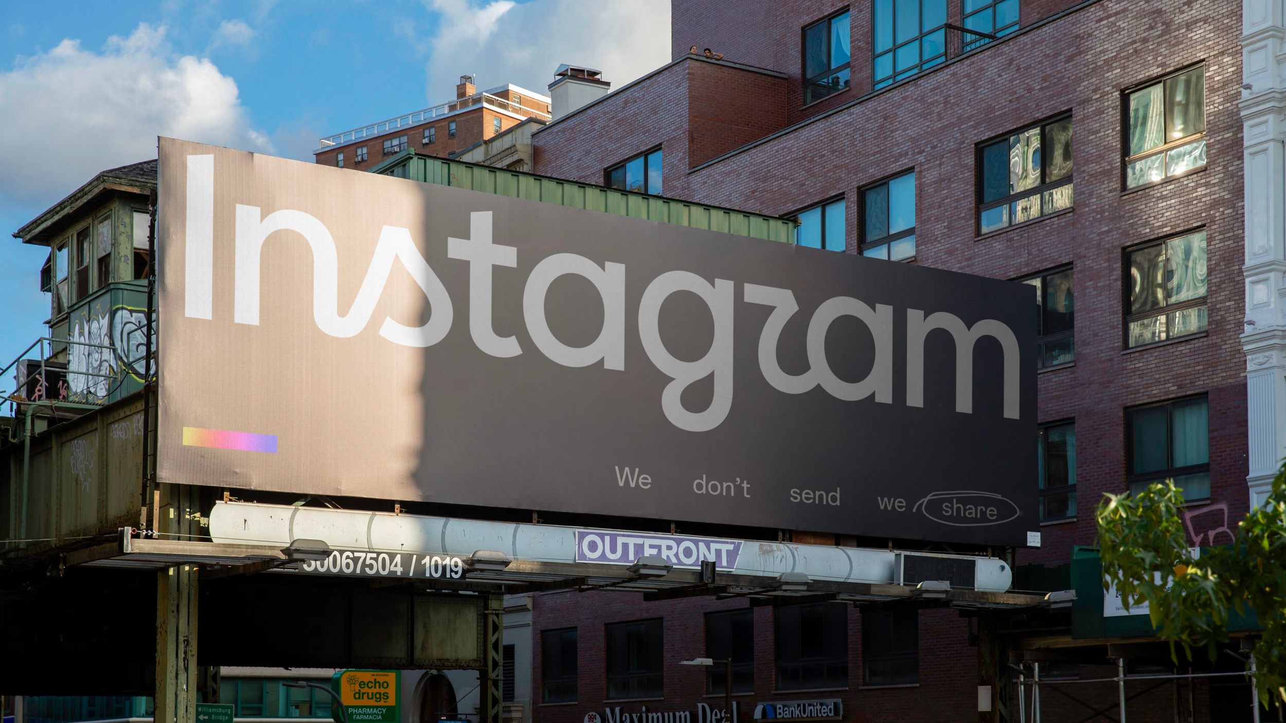
The icon stays. The camera app icon is unchanged, but the gradient is set to be used more sparingly.
A gradual rollout. Across the app, web, and official materials through 2026.
Novo: a new name and a new culture
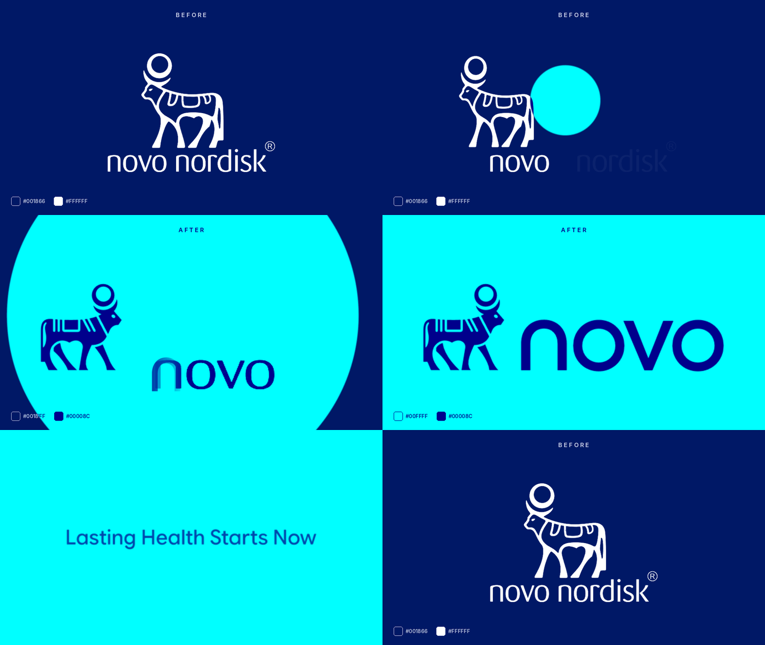
The logo story: Novo Nordisk now goes by “Novo” (the legal name stays Novo Nordisk A/S). The Apis bull has been retained, but it’s been modernized and now faces right.
Beyond the logo:
New positioning. “Lasting Health Starts Now”—the idea that long-term health begins with progress you can feel today.
New colors. A brighter “Lasting Blue” as the primary, with “Now Turquoise” as an accent. (Note how the color names carry words from the tagline.)
A new typeface, also called Novo.
A culture reset. "The Novo Way," a new set of principles for how the company operates, decides, and competes—launched alongside the rebrand.
Patterns observed in these brand refreshes
1. Heritage as a design resource. McLaren went back to a 1960s service station sign for logo inspiration. Carter’s went back to its 19th-century script. Novo kept its bull. Instagram nodded to its earlier scripts.
2. Lots of custom type. McLaren Sans, Tally, Instagram Sans/Pen/Mono, Novo. Typography is one way brands stay recognizable even when the logo isn’t on screen.
3. Rebrands as architecture decisions. McLaren unified racing and road cars. Intuit unified a portfolio. Novo unified around one name. The visual refresh is often the visible tip of an organisational decision.
4. Symbols built to stand alone. The Palm T, the Intuit I, the Carter’s star. In a world of app icons, favicons, cup sleeves, and profile pictures, brands need marks that work at 16 pixels square.
5. Launch day as the start, not the end. Carter’s refreshed brand is phasing in over two years. Instagram is rolling out gradually. Tropical Smoothie will be updating cafes, app, and web.
6. Strategy first. “Let every child's light shine.” “Lasting Health Starts Now.” “Eat Some Good!” “One Intuit.” The logos get the comments—but the idea(s) behind each one is what drives the broader change in the identity, brand, and business.
So, now that you’ve seen more of each brand refresh, have any of your opinions changed?