
The many faces of the 2026 Winter Olympics
Every Olympic Games has a story to tell—and a visual identity that helps bring that story to life. For the 2026 Milano Cortina Winter Olympics, the journey from bid to broadcast produced several fascinating logo concepts in addition to the now-familiar core mark. Let’s walk through five different visual identities tied to this year’s Games, then take a peek at what’s coming next with French Alps 2030 and Utah 2034.
Milano Cortina 2026 candidate bid logo
Before Italy won the hosting duties, their bid had its own identity. Early designs featured a stylized depiction of Milan Cathedral transforming into mountain peaks, blending the urban spirit of Milan with the dramatic alpine landscape of Cortina d’Ampezzo. The logo also nods to Italy’s flag through its color palette. This bid logo set the tone for a campaign rooted in place and design heritage.
Interim identity (2019–2021)
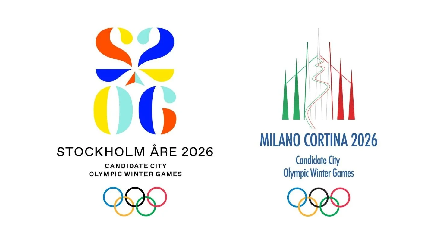
After winning the 2019 host city selection over Stockholm-Åre, which had its own unique identity, Milano Cortina's 2026 bid logo continued to serve. It helped maintain continuity during the transition from bid to event planning.

Dado vs Futura: the first public logo vote in Olympics history
In a historic first, the 2026 Olympics emblem was chosen through a global online vote. Two designs, “Dado” and “Futura,” were presented. Dado, the runner-up, embraced a more colorful, playful concept featuring winter sport elements and motifs that could shift dynamically around the design. Though it didn’t win, Dado remains an intriguing alternative vision for these Games.
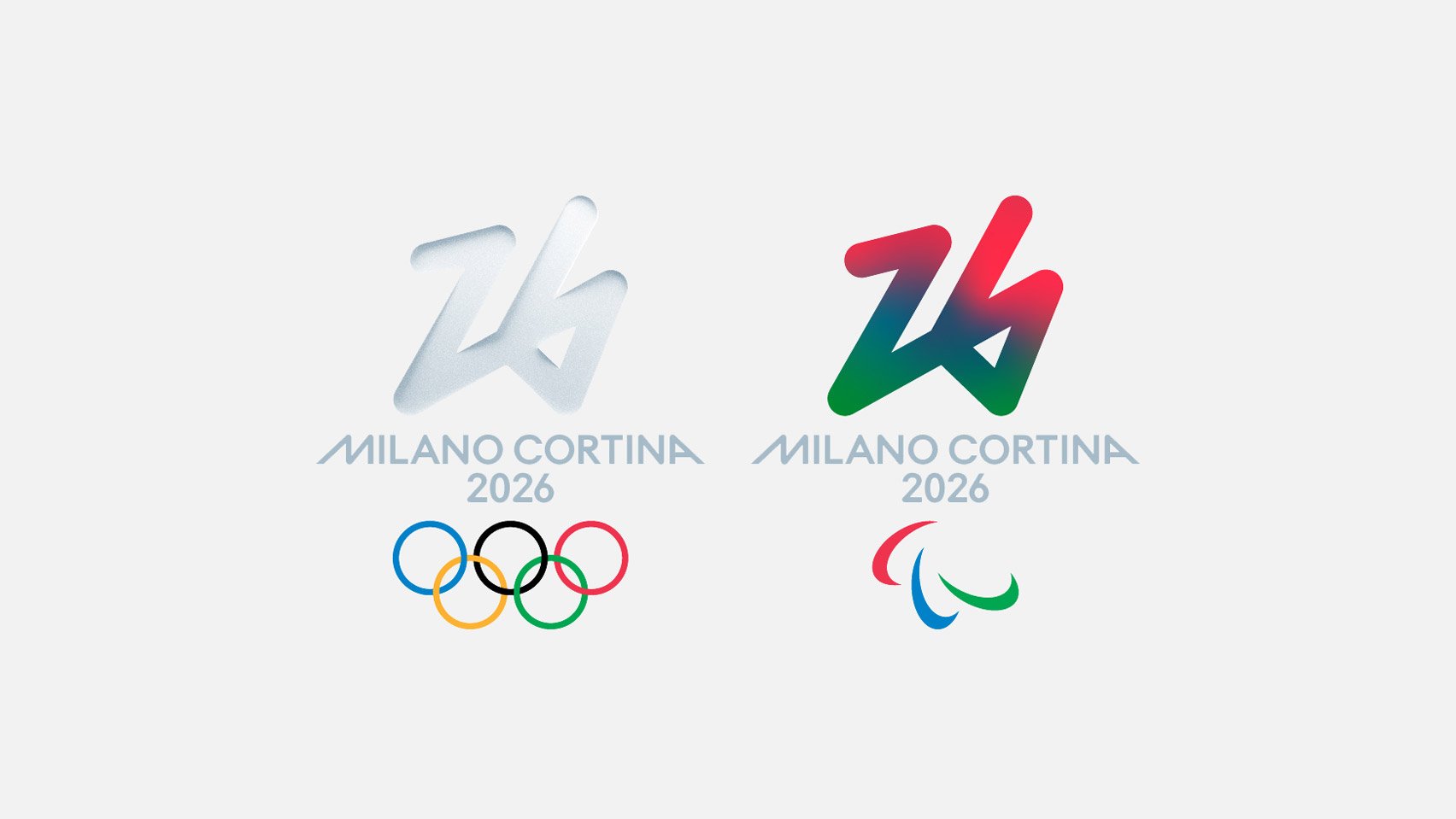
The winning emblem, Futura, claimed nearly 75% of votes from more than 870,000 participants worldwide. It depicts the number 26, seemingly traced in snow with a single, continuous line—a graphic metaphor suggesting that small gestures can change the world. This minimalist line work aims to reflect values like sustainability and inclusivity. And because it was selected by the public, it stands as one of the most participatory Olympic logo decisions.
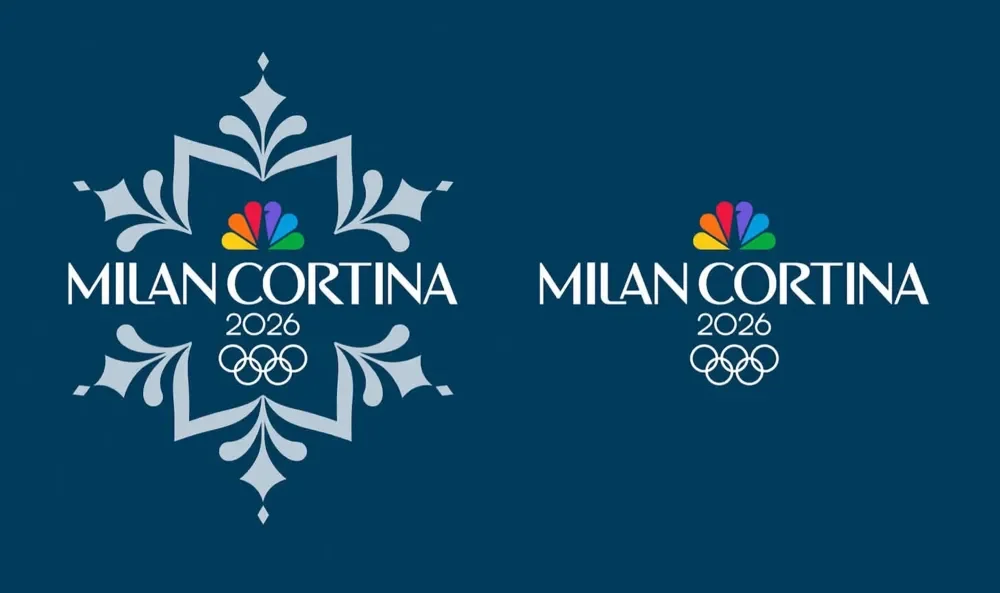
NBC’s snowflake-inspired broadcast logo
Viewers in the U.S. encountered a slightly different Olympic mark during broadcasts. NBC’s branding for Milano Cortina 2026 incorporates a snowflake-structured emblem that weaves together the familiar NBC peacock, Olympic rings, and a unique “Milan Cortina” wordmark. Designed for television and digital platforms, this snowflake mark helps unify NBC’s coverage across various media.
Future Winter Olympics
As the 2026 Milano Cortina Games wrap up, fans and athletes are already looking ahead to the next Winter Olympics—the 2030 Winter Olympics in the French Alps followed by Utah 2034 in the United States.
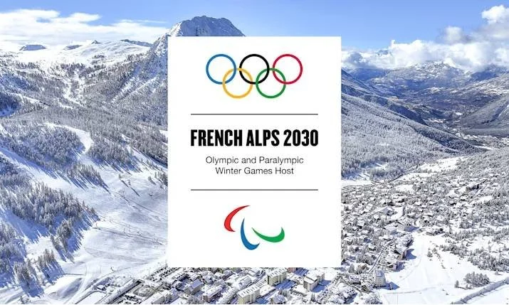
French Alps 2030: a new Alpine chapter
The 2030 Winter Olympics have officially been awarded to the French Alps. Scheduled for February 1–17, 2030, these Games will take place across several Alpine host hubs in southeastern France, including Hautes-Alpes, Savoie, and the Côte d’Azur region around Nice. The Paralympics will follow in March.
The French Alps will join the prestigious list of previous French hosts—Chamonix (1924), Grenoble (1968), and Albertville (1992)—continuing France’s deep Olympic heritage. Instead of unveiling their official emblem during the closing ceremony of the 2026 Games, the organizers plan to reveal the French Alps 2030 official logo in the spring of 2026. For now, only a text-based placeholder exists.
Utah 2034: a modern rebrand
The following Winter Games are set to take place in Utah (in the U.S.) in 2024. The provisional logo for these Games appeared in November 2025, but with a twist: while the bid logo contained both “Salt Lake City” and “Utah,” the new logo simply reads “Utah 2034.” This rebrand reflects a broader geographic identity for the event, encompassing the whole state and future venue regions instead of just a single city.
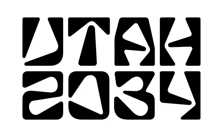
The current Utah 2034 logo is a typographic mark featuring stylized characters meant to evoke Utah’s landscapes, grids, and indigenous petroglyph forms. Reactions have been mixed: while some designers appreciate the mark’s boldness and adaptability, others find it unusual or hard to read, with the state’s governor even joking that “everyone seems to not like it.” Regardless, this transitional logo will serve as the identity for these Games until a full identity is unveiled closer to the actual event.
Final thoughts
These visual identities—and the evolution of Olympic logos over time—tell a bigger story than just design trends. They reflect how global events are shaped by culture, technology, public opinion, and media storytelling. From the Milano Cortina 2026 fan-voted emblem to alternate 2026 concepts and from NBC’s broadcast branding to Utah 2034, we’re watching the Olympics become more participatory, more expressive, and more brand-driven than ever before.